
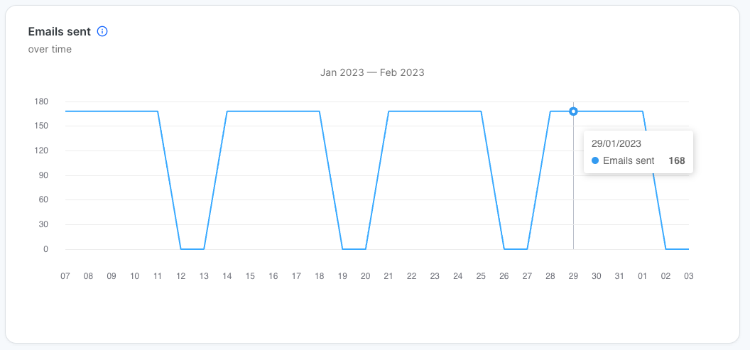
The metrics explained in Simulation overview metrics also feature in charts showing their development over time. Data is shown for the time between the campaign start date and their current date. Hovering over the chart line allows you to view the exact data for a given date. Note that all charts with the exception of the Emails sent over time chart are cumulative.
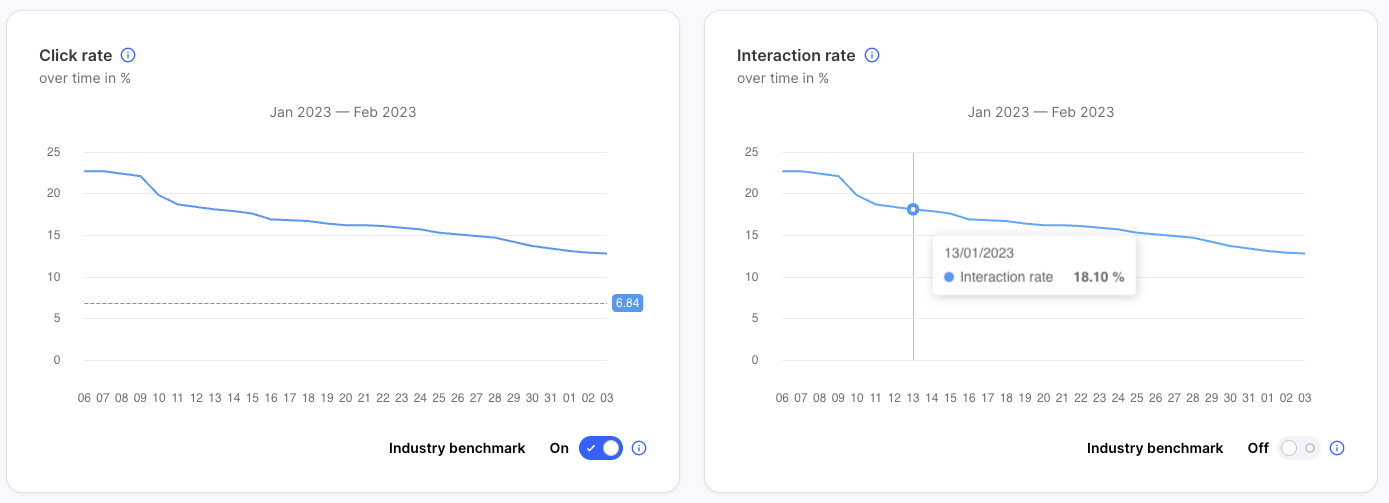
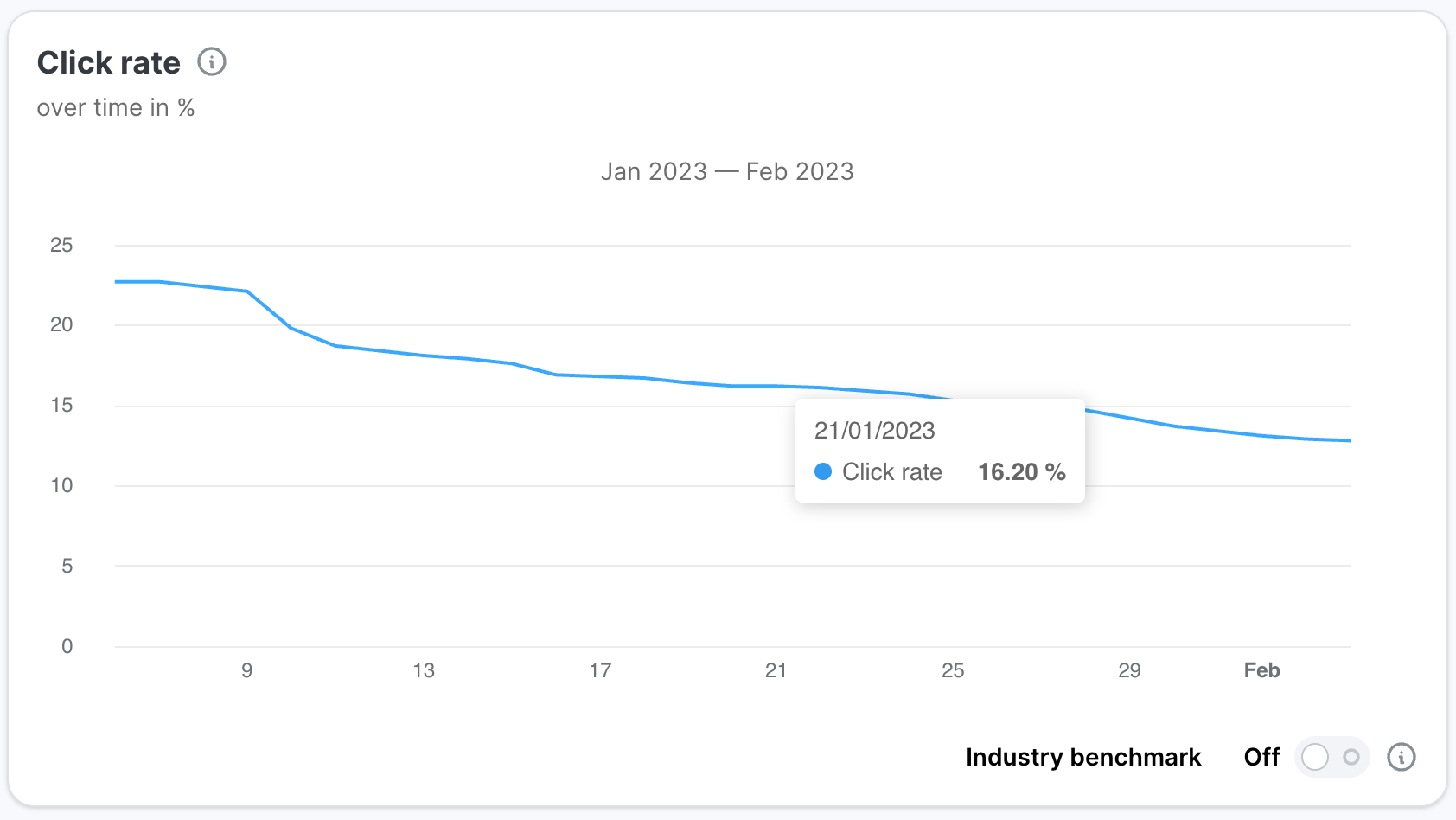
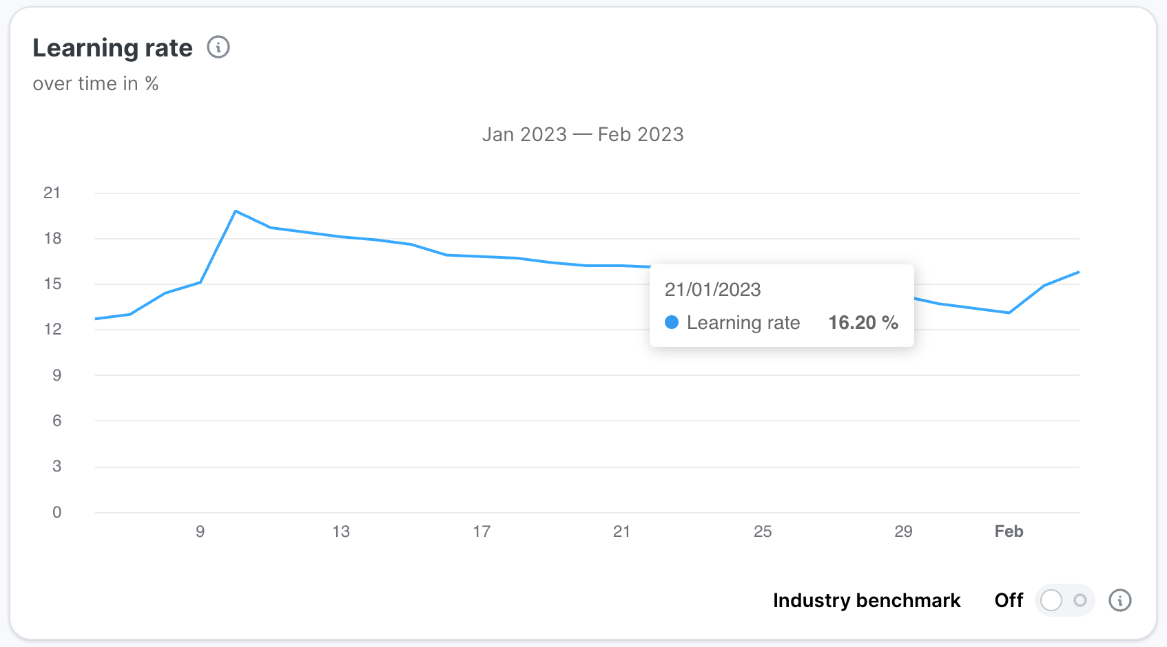
Industry benchmark
Benchmarks are provided as a way for users to get an understanding of their performance related to the average performance in their industry. Values are industry-specific, and users with no industry will see a benchmark value that is the average across all industries. When activated, the graphs will show an additional horizontal line representing the results of the top 20% performers in your industry. If no industry information is set up for your account, you will see a benchmark value averaged based on the top 20% performers across all industries. These values are based on our internal data.
Emails sent over time
This chart is an exception since it does not show cumulative data. Instead, it shows how many simulated emails were sent on a given day throughout the campaign.
Click rate over time
Cumulative click rate over the length of the campaign. Cumulative values are based on all data points between the start of the campaign and the current date.
Learning rate over time
Cumulative learning rate over the length of the campaign.
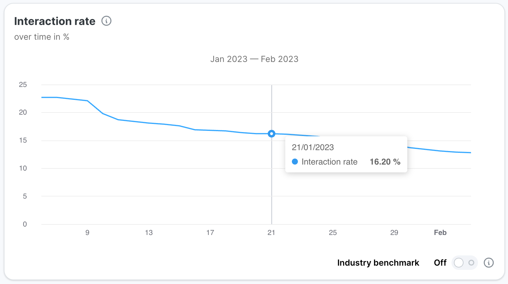
Interaction rate over time
Cumulative interaction rate over the length of the campaign.
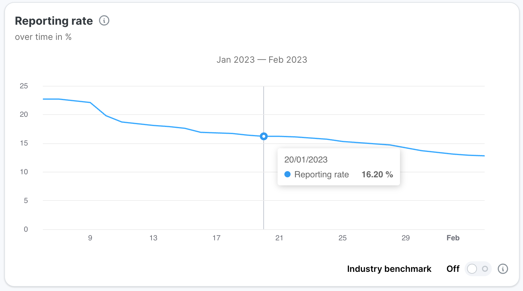
Reporting rate over time
Cumulative reporting rate over the length of the campaign.
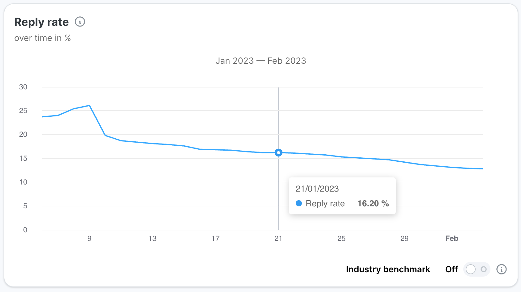
Reply rate over time
Cumulative reply rate over the length of the campaign.
Multiple clients / Multiple tenants behavior
For all over time metrics, the calculation for Multiple Clients and Tenants combines events from all included campaigns. Total counts will therefore be the sum of all individual campaign accounts, and the rates will be the division of the combined sums.