Read this article in: Deutsch
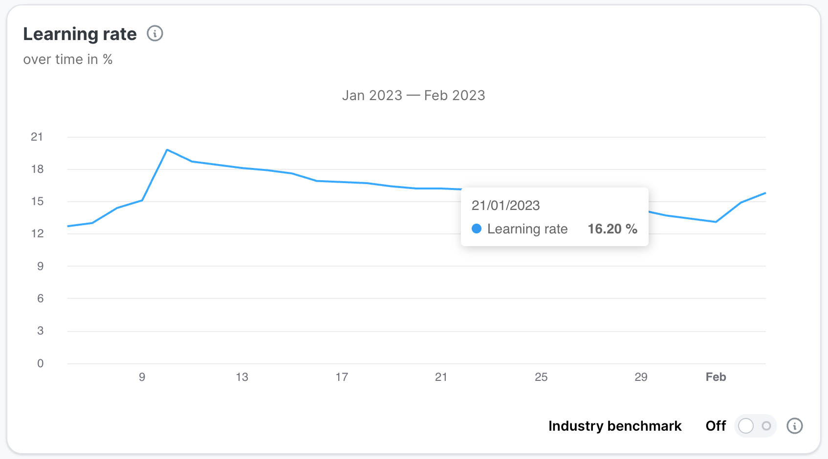
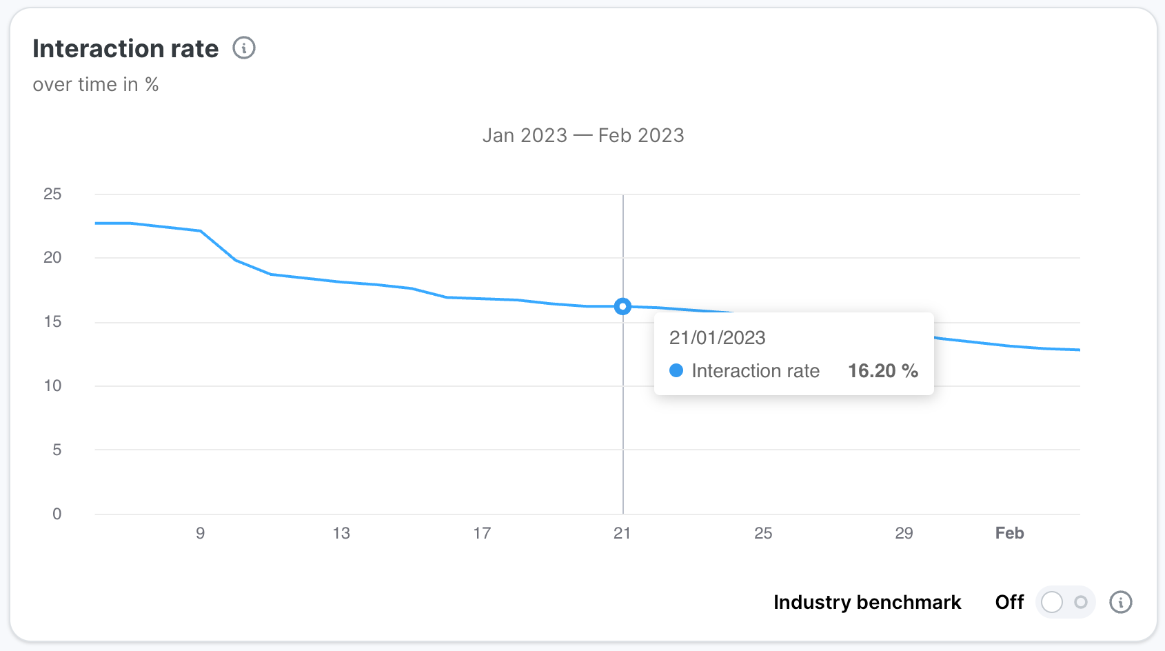
The metrics explained in Partner Platform Simulation overview metrics also feature in charts showing their development over time. Data is shown for the time between the Phishing Simulation start date and their current date. Hovering over the chart line allows you to view the exact data for a given date. Note that all charts with the exception of the Emails sent over time chart are cumulative.
Industry benchmark
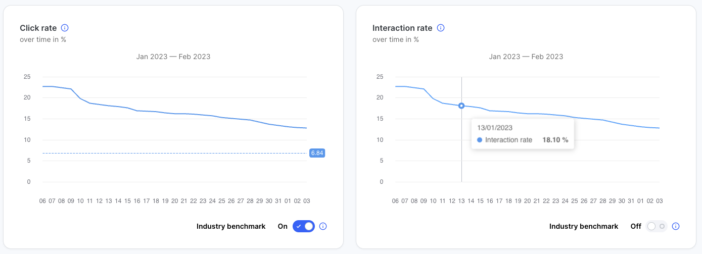
Benchmarks are provided as a way for users to get an understanding of their performance related to the average performance across all industries. When activated, the graphs will show an additional horizontal line representing the results of the top 20% performers across all industries. These values are based on our internal data.
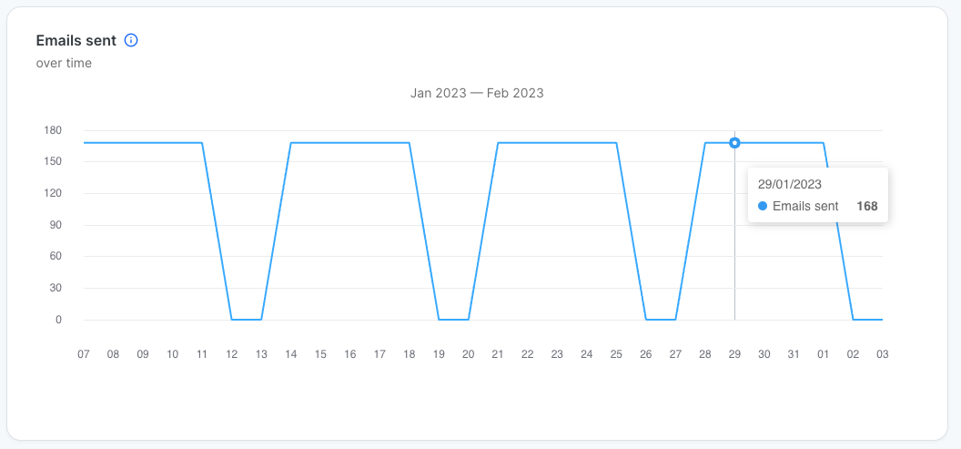
Emails sent over time
This chart is an exception since it does not show cumulative data. Instead, it shows how many simulated emails were sent on a given day throughout the Phishing Simulation.
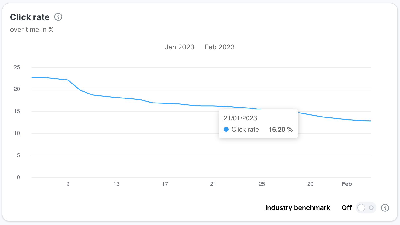
Click rate over time
Cumulative click rate over the length of the Phishing Simulation. Cumulative values are based on all data points between the start of the Phishing Simulation and the current date.
Learning rate over time
Cumulative learning rate over the length of the Phishing Simulation.
Interaction rate over time
Cumulative interaction rate over the length of the Phishing Simulation.
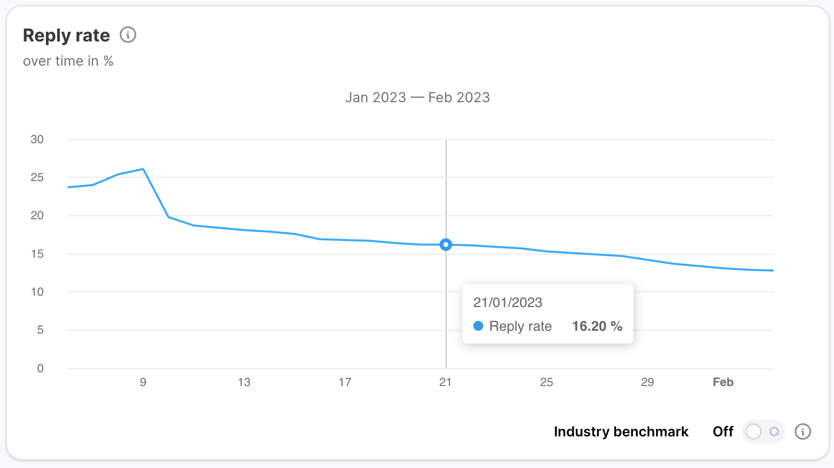
Reply rate over time
Cumulative reply rate over the length of the Phishing Simulation.